
Category: Maps
-

Mapping Emotion in Seattle: Downtown Fear
If you ever watch the news, you’ll notice that the media loves to hate on Seattle, a supposed lawless, liberal hellhole rampant with crime, drug use, and homelessness. These stories usually have some truth to them, but the media embellishes to appeal to their viewers, the vast majority living outside of the urban core. It…
-
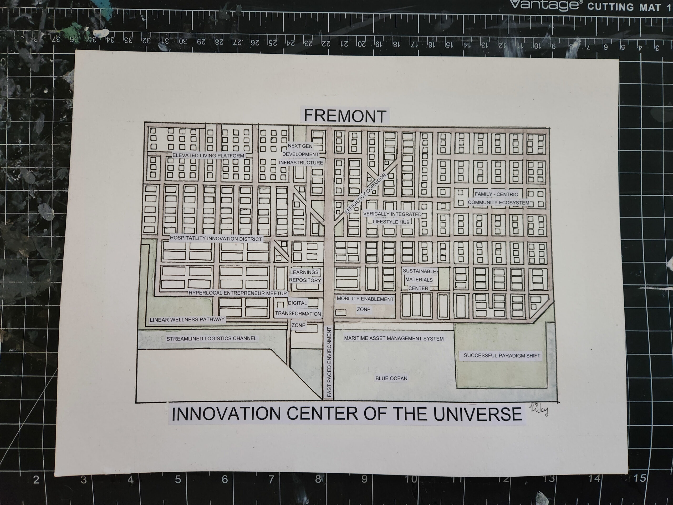
Mapping Emotion in Seattle: Bored Fremont
I lived in Fremont for 2 years (add another year if you include the part of Wallingford on this map). While I enjoyed easy waterfront access and the view at Gas Works Park, I ultimately moved away due to boredom. The corporate tech takeover of the neighborhood has made Fremont has lose its soul, though…
-
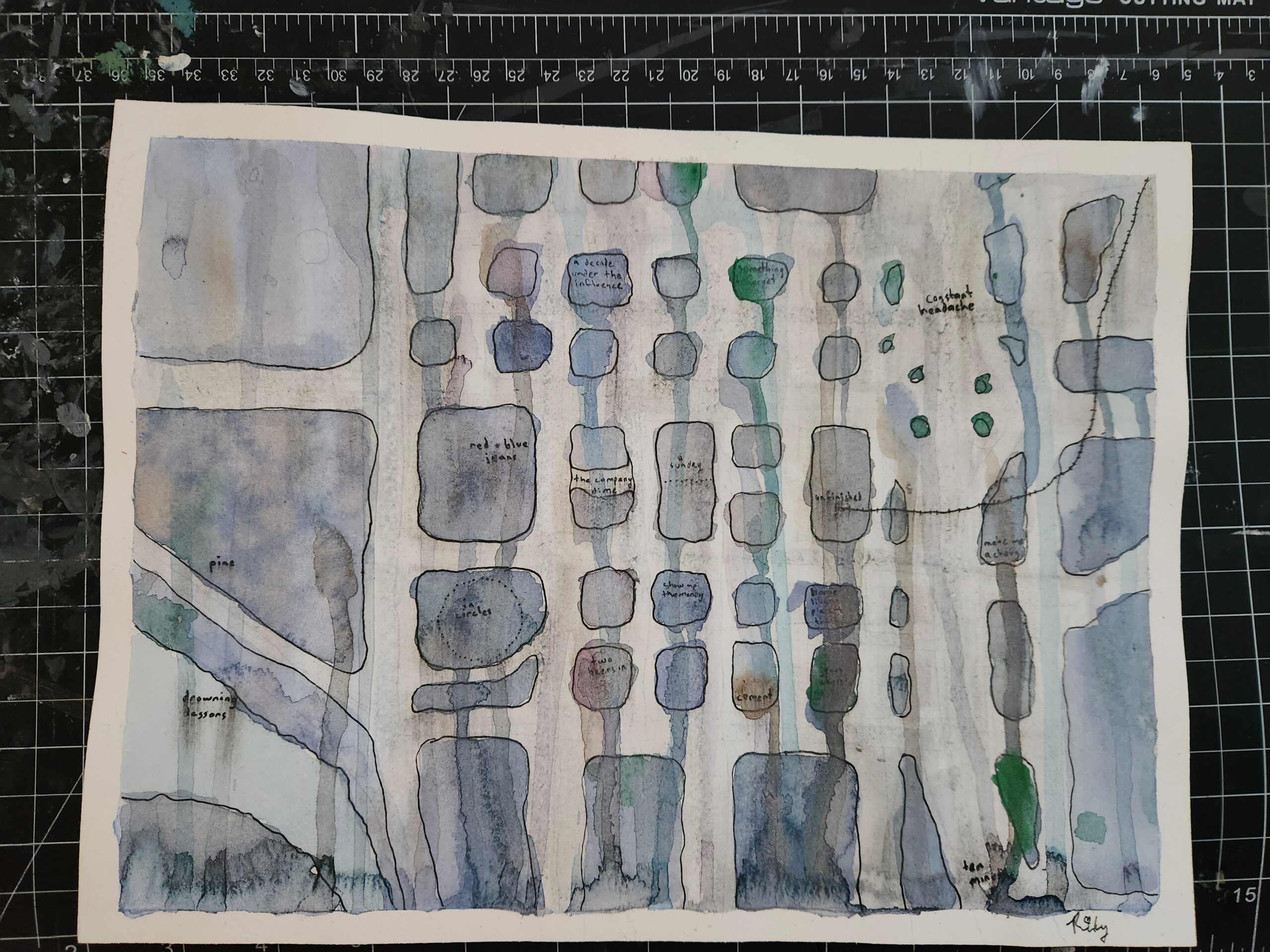
Mapping Emotion in Seattle: Sad Bellevue
I used to live in Downtown Bellevue, and I hated it. It felt like someone took the corporate soullessness of South Lake Union and somehow made it less walkable (hence why I exaggerated the width of the streets in this map). So when I decided to make a map inspired by sadness, Bellevue was the…
-
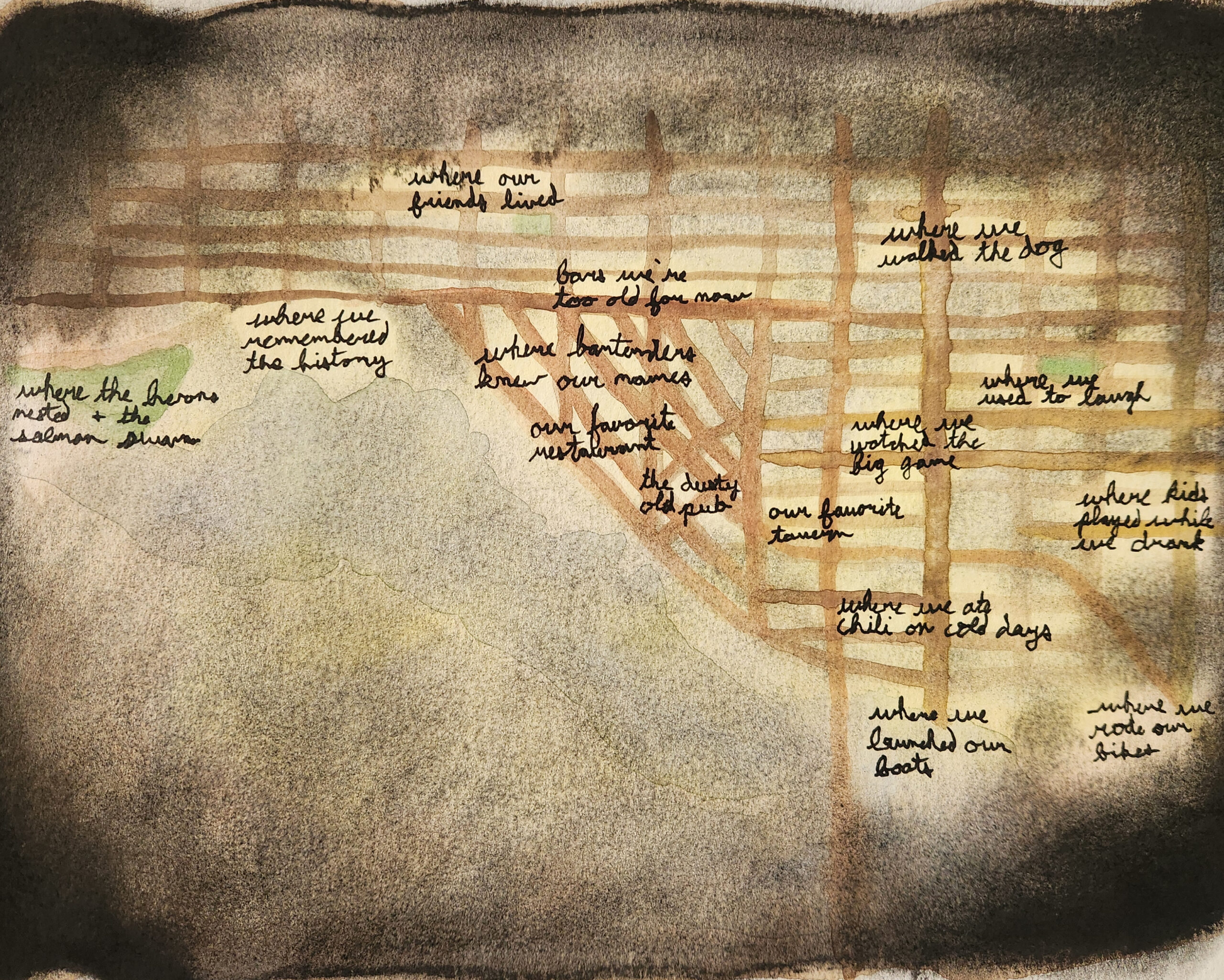
Mapping Emotion in Seattle: Nostalgic Ballard
Continuing my series of emotion-inspired maps of Seattle, I chose nostalgia for this piece centered on Ballard, a neighborhood I associate with some of my favorite memories. Ballard has an old-school charm to it: old brick, quiet tree-lined streets, flickering signs. I wanted the map to capture that hazy, bittersweet feeling of looking back at…
-
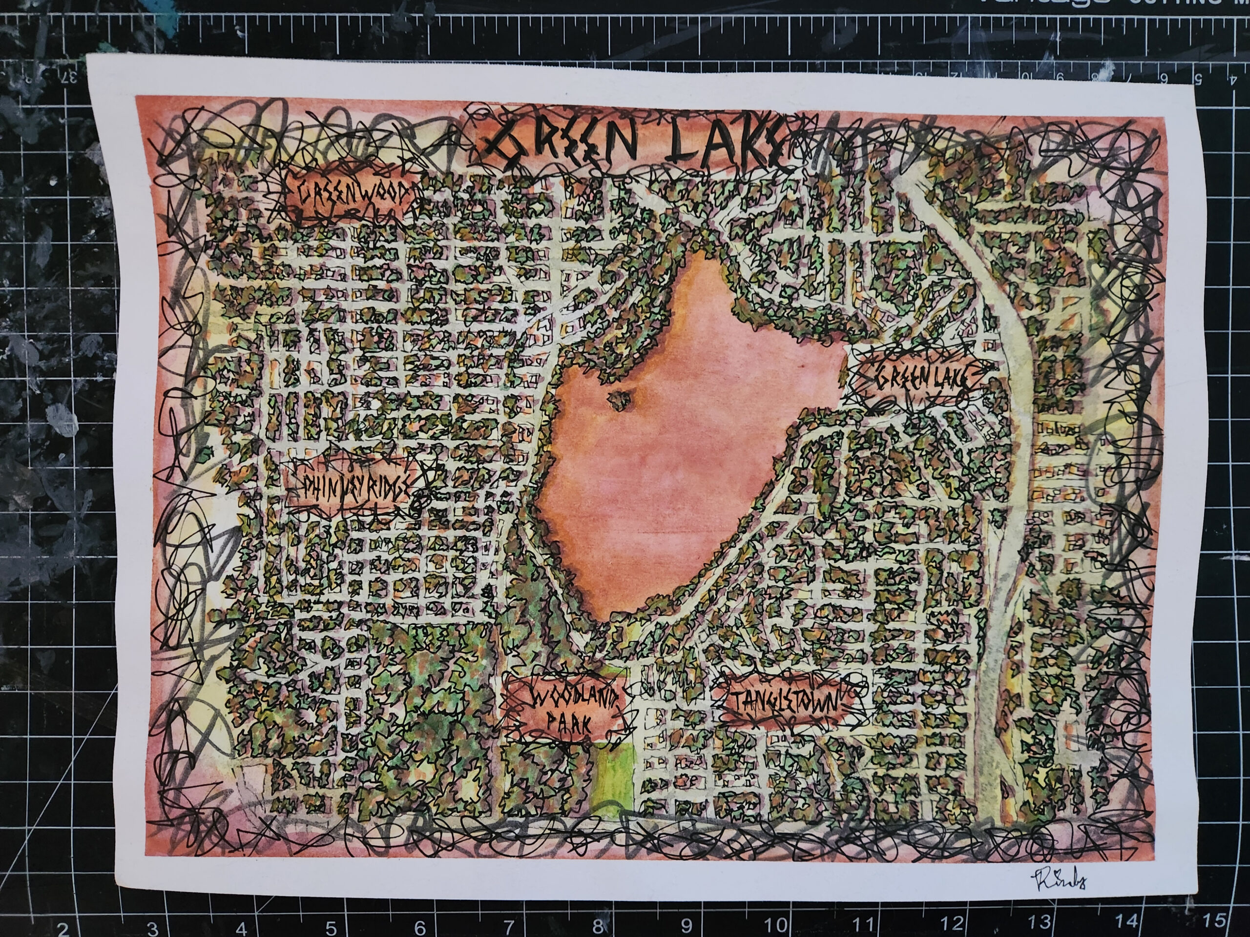
Mapping Emotion in Seattle: Angry Green Lake
Maps are usually neutral, built to inform rather than to feel. This was my first piece in a series of emotion-inspired maps of Seattle, an experiment in expressing feelings through cartography. I chose anger for this one because Green Lake reminds me of the time I was so mad after being rejected by my crush…
-
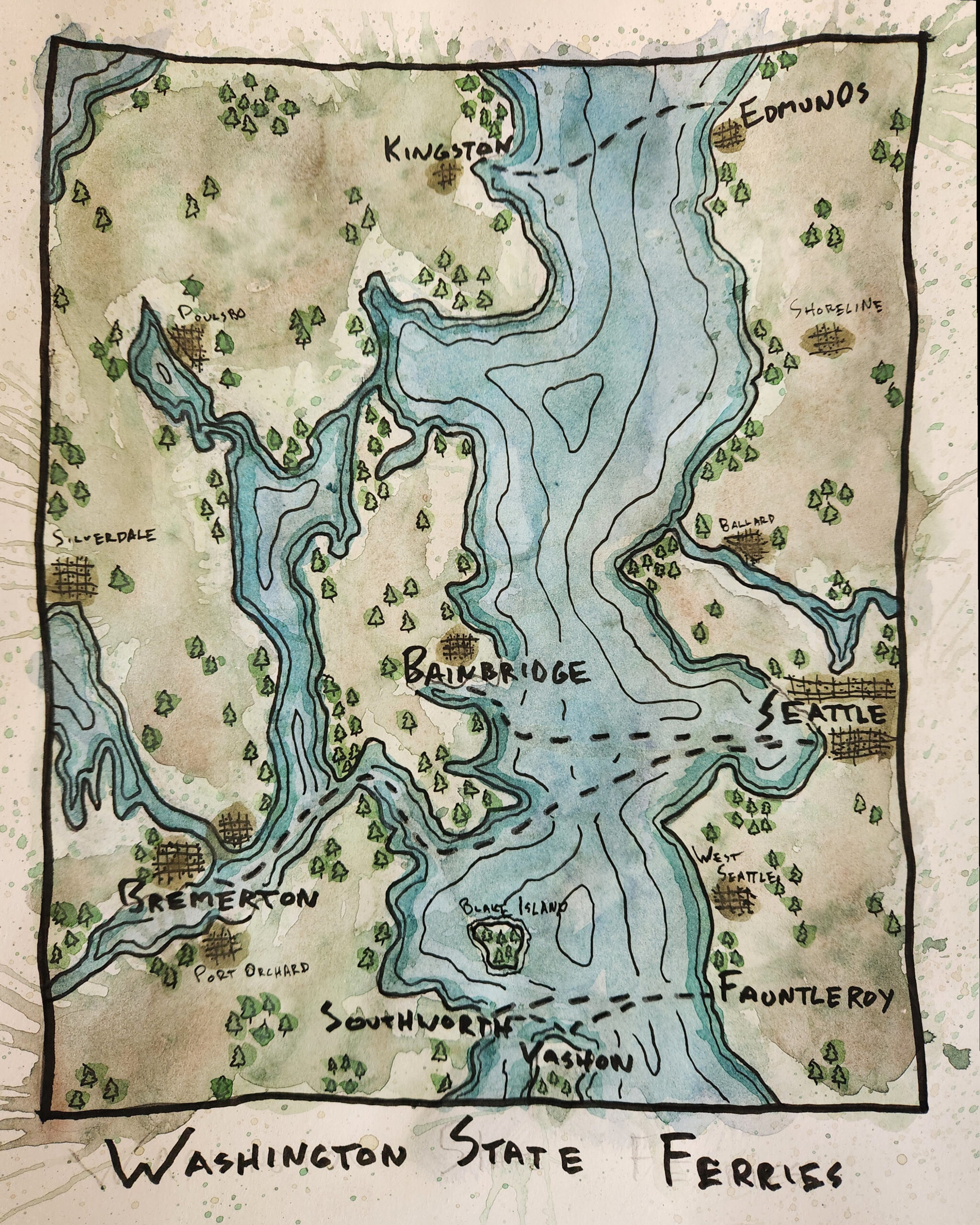
Washington State Ferries in Seattle: A Hand-painted Map Inspired by Rainy Days
Inspired by Bob Ross and the urban sketching movement, I started painting during the pandemic. Somehow, it took me five years to realize I could paint maps too! I’d been experimenting with data from the State of Washington’s Geospatial Open Data Portal, trying to build a 3D map of Seattle’s ferry network in Blender. After…
-
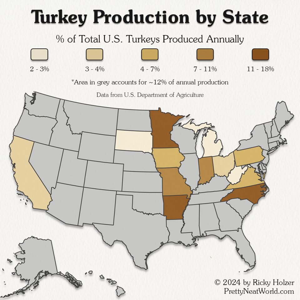
Which State Produces the Most Turkeys?
The United States produces over 200 million turkeys annually. Almost half of the turkeys come from three states: Minnesota, North Carolina, and Arkansas. Data for this map is from the U.S. Department of Agriculture National Agricultural Statistics Service showing the number of turkeys produced in 2023. Related Maps
-
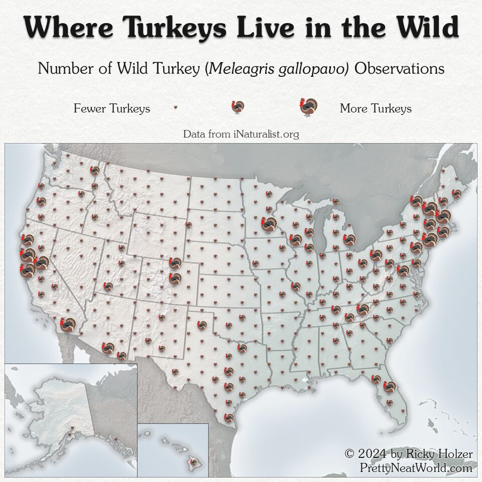
Where Do Turkeys Live in the Wild?
Wild Turkeys (Meleagris gallopavo) can be observed in all 50 states in America, according to data from iNaturalist.org. Some unique hotspots for turkeys are southeastern Arizona and California, eastern Washington, central Florida, Southern Wisconsin, and New England. Turkeys are uncommon in Alaska and are only seen on the Big Island of Hawaii. No observations were…
-
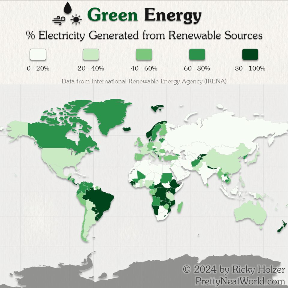
Which Countries Make the Most Renewable Energy?
Inspiration from this map came from a Wikipedia hole I fell into, where I learned that Paraguay runs entirely on renewable energy (mostly hydro power). This is a rare map where many developing nations perform better than the industrialized world. Data comes from International Renewable Energy Agency (IRENA), the most recent year available being 2022.…
-
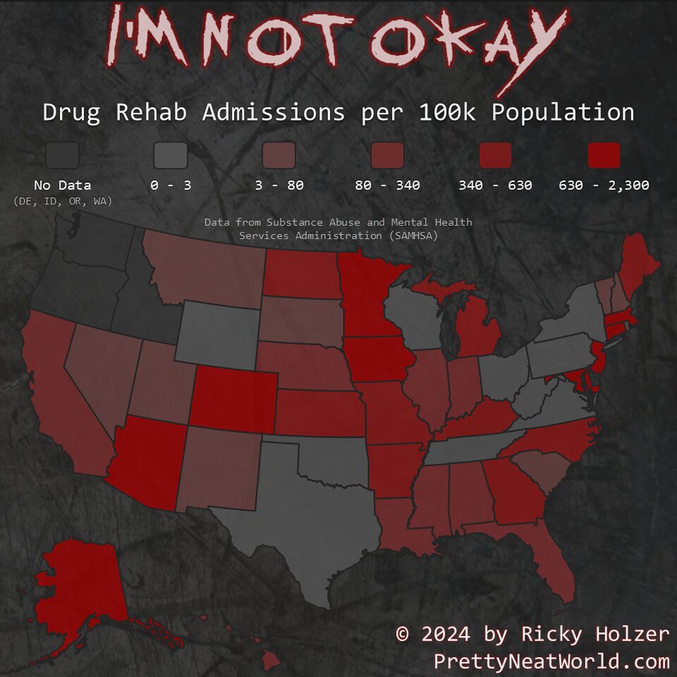
Which States Need Rehab the Most?
Where do people go to rehab the most? Not where you might expect! The Midwest has many states with a high incidence of rehab admissions. Data comes from the Substance Abuse and Mental Health Services Administration (SAMHSA) Treatment Episode Data Set (TEDS). Note that this data only includes admissions to a rehab facility, and that…