
Author: Ricky Holzer
-
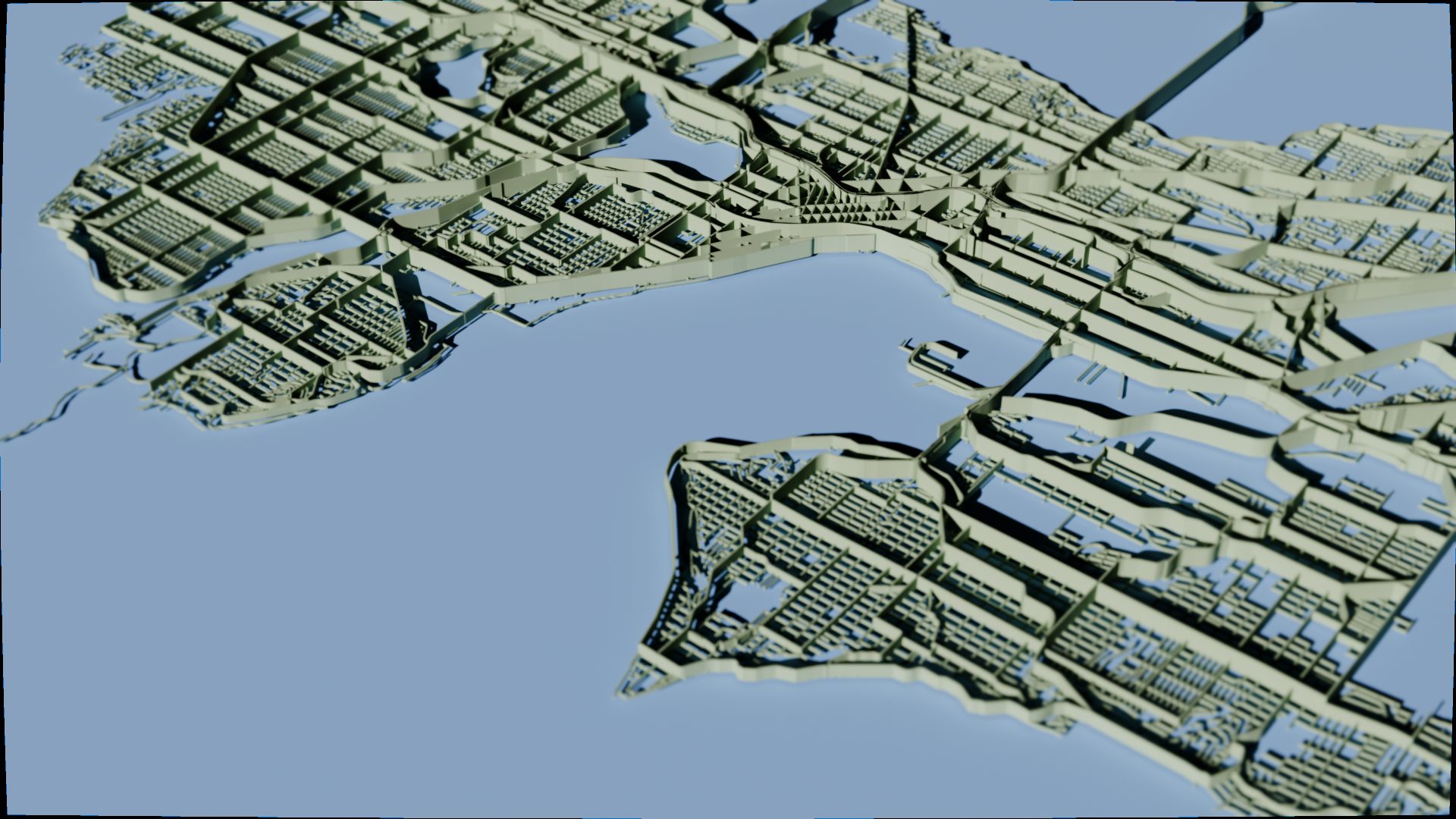
Visualizing the Barrier Effect of Roads in Seattle Using BlenderGIS
I was inspired by Mapbox designer Topi Tjukanov’s 3D map called “Barrier Effect” that tries to illustrate the dividing effect roads can have on cities. Pedestrian accessibility is something I am passionate about, so I wanted to see what his concept would look like in my own city of Seattle. To get started, I downloaded…
-
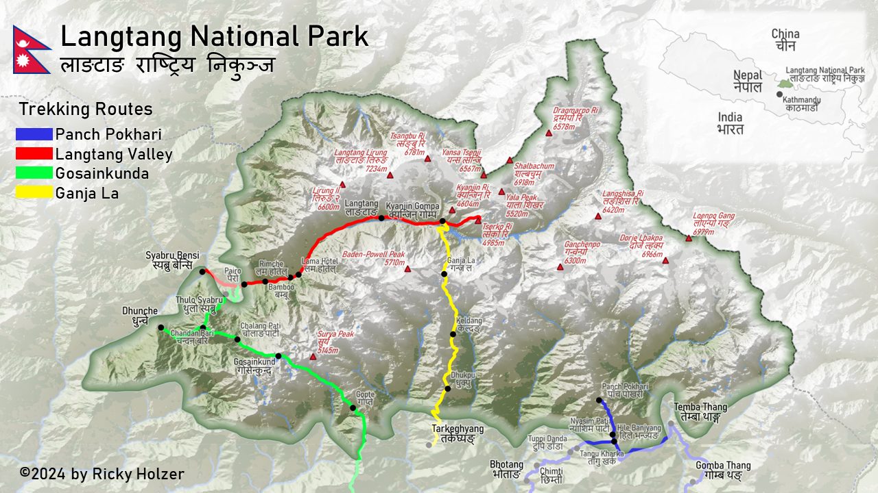
Mapping Trekking Routes in Nepal’s Langtang National Park Using QGIS
This past January I had the pleasure of visiting Nepal and trekking through the Langtang Valley, a wonderfully scenic place tucked away in a remote corner of the Himalayas. As is now required by law, I hired a guide to navigate the backcountry trails. After a bumpy ride in a packed SUV over some of…
-
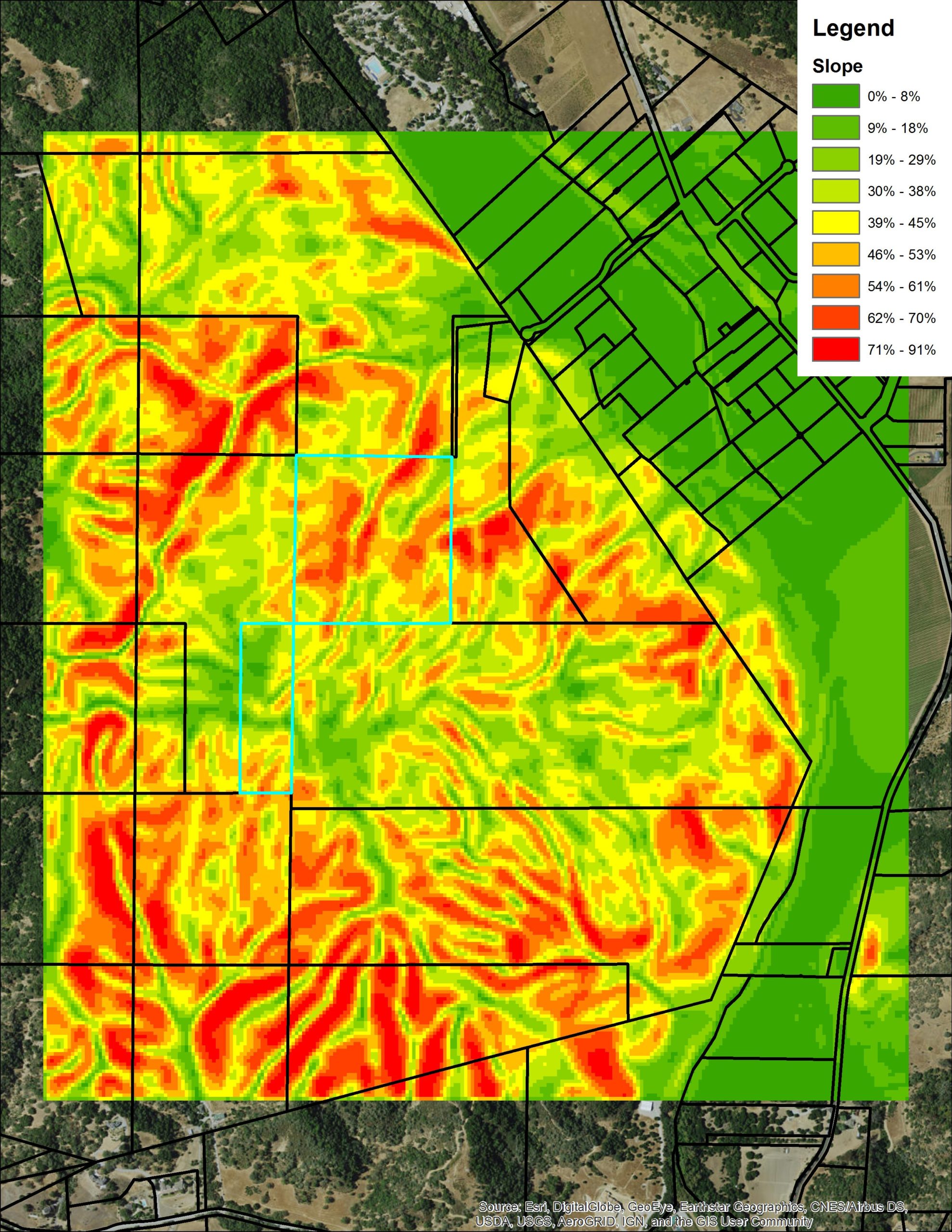
Elevation Profile of Parcel for New Home
A client wanted to quickly know elevation details for a parcel to build a custom home. He was unable to visit the site himself and did not want to spend the money for a survey crew. Within a few hours, I was able to show him the site had many steep slopes and was not…
-

Due Diligence for Car Wash Locations
A client had identified several cities where he wanted to expand his car wash franchise. He needed maps and data to present to investors to demonstrate the viability of the sites he selected. In addition to standard demographic information, I provided extra information related to vehicle ownership and traffic given the business’s focus on cars.…
-
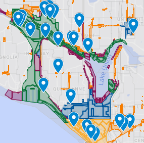
Site Selection for New Seattle Business
A client approached me wanting to know the best location for his new business. He hoped to be able to present a map and data to investors to justify his site selection and potential revenue. His goal was to identify areas within Seattle city limits that 1) had sufficiently high household income to support his…
-
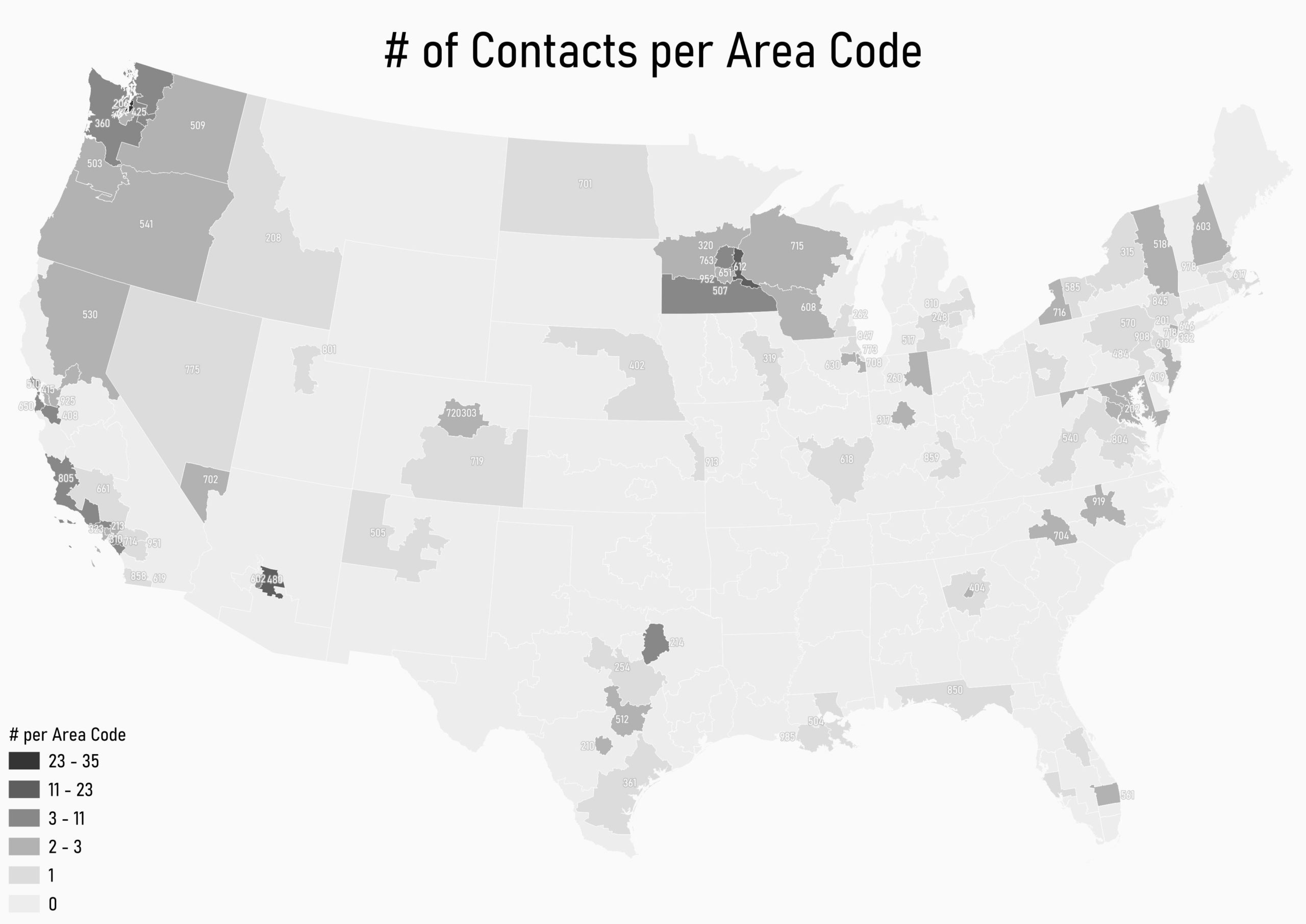
How to Map Your Phone Contacts by Area Code
I was looking for map inspiration when I stumbled across an atlas of projects on Daniel Huffman’s blog, somethingaboutmaps. His map of his contacts by area code seemed like a fun and easy exercise to repeat. Data Acquisition The hardest part of this map (like most GIS projects) was finding and preparing the necessary data.…
-
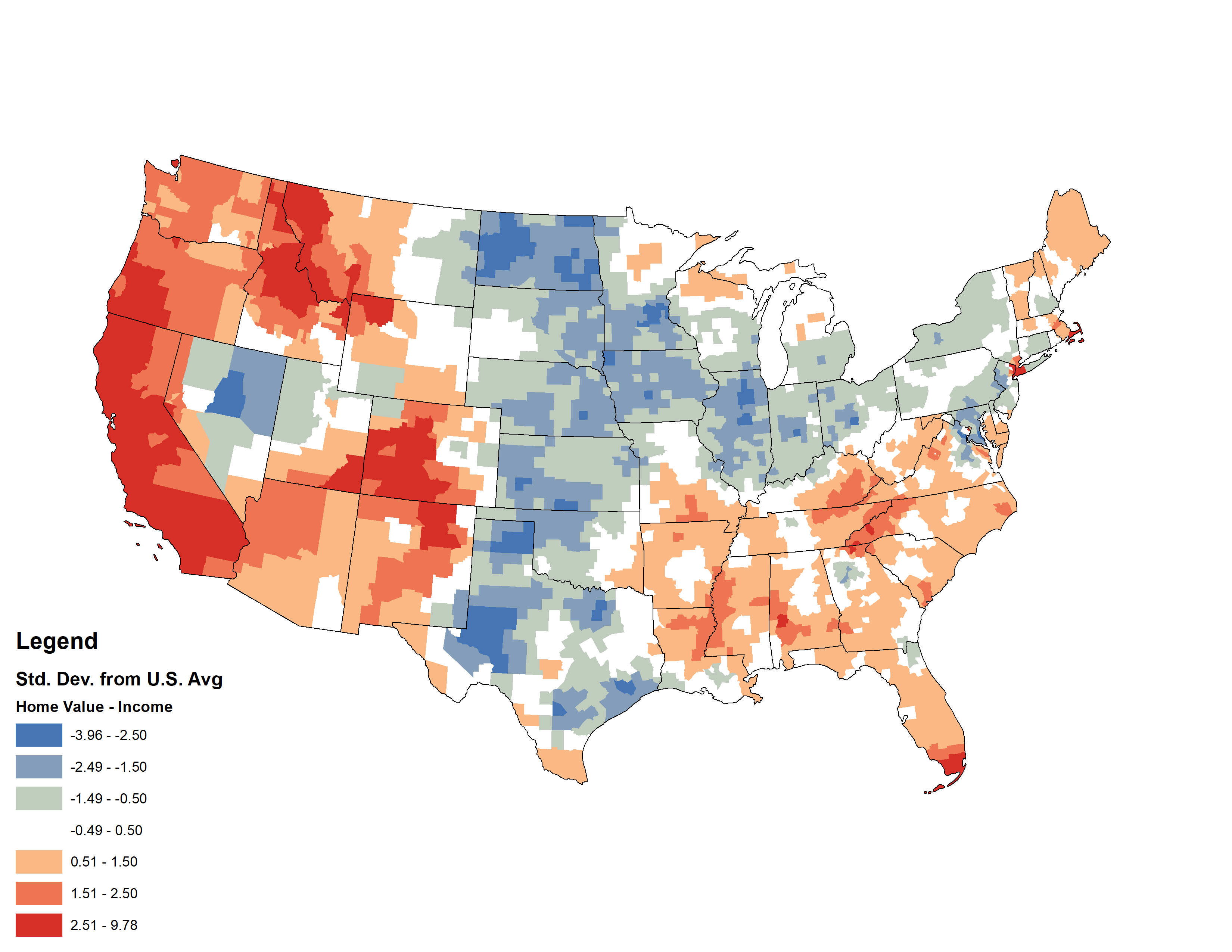
Comparing Median U.S. Home Values and Incomes
This week, my coworker showed me a cool map from Esri’s Living Atlas relating median home values with median incomes in the U.S. — click the image below to pull up the interactive map. I thought it was a cool idea, but something bothered me about the map. Later that night, I had a shower…
-
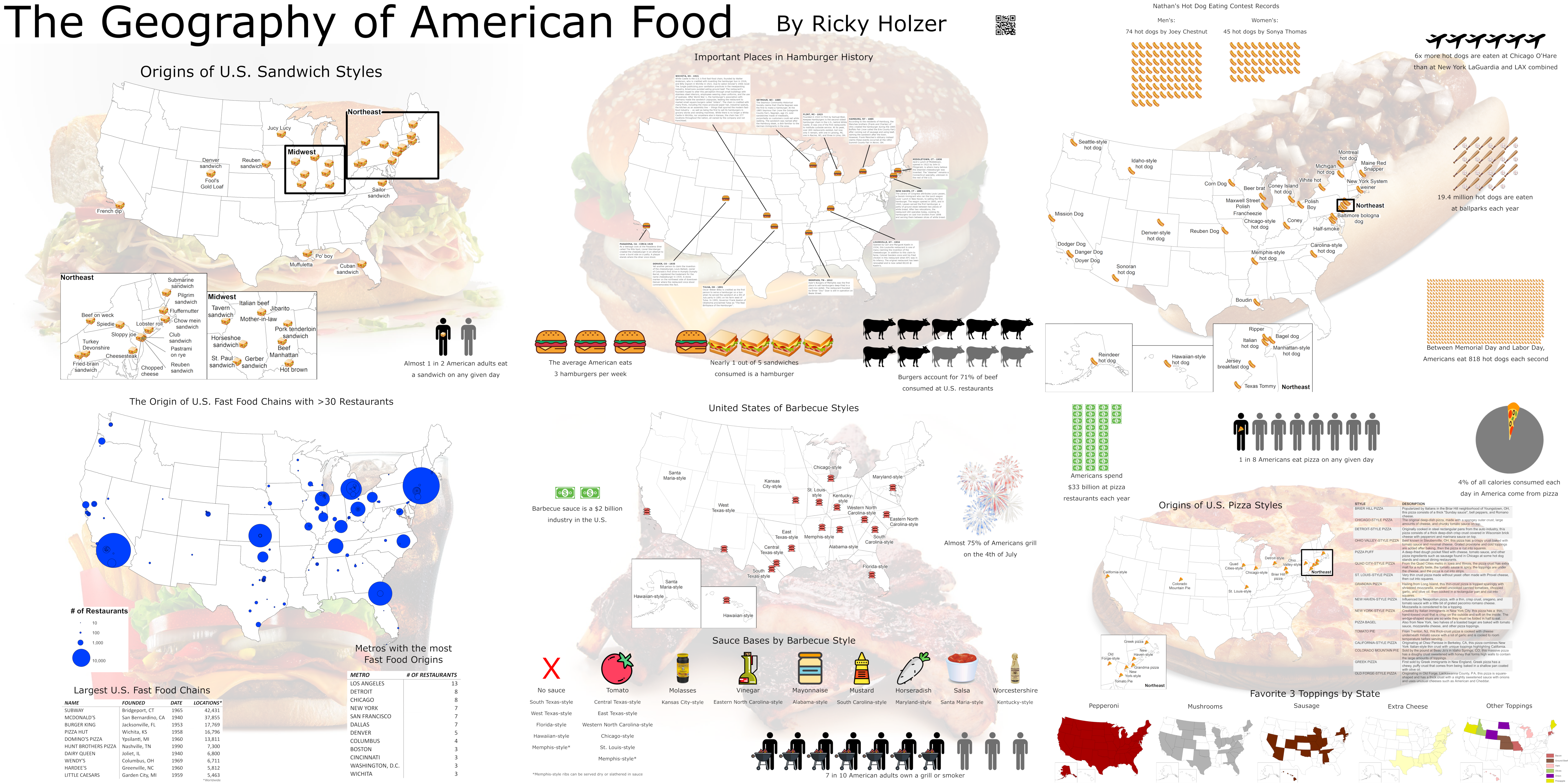
The Geography of American Food
I made this poster for the Minnesota GIS/LIS Consortium 2019 Conference. Stay tuned for posts diving deeper into barbecue, hamburgers, pizza, sandwiches, hot dogs, and fast food!
-
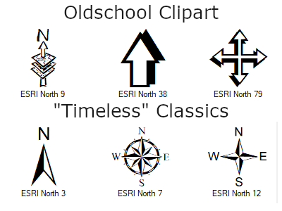
Adding Custom North Arrows to ArcMap 10.X
By far the easiest way to tell if someone used ArcMap to create their map is by looking at the north arrow. The first version of ArcMap, 8.0, was released at the end of 1999, and most of the software\’s included north arrows reflect the clipart-y style of that era. One of the simplest ways…
-
Analyzing Fires in Minneapolis Across Space and Time
After recently attending the Esri UC and listening to many sessions about spatial analysis, I have been inspired to test what I’ve learned. The City of Minneapolis where I currently live has an excellent open data portal, just waiting for GIS nerds like me to download and have some fun. Now I will walk you…