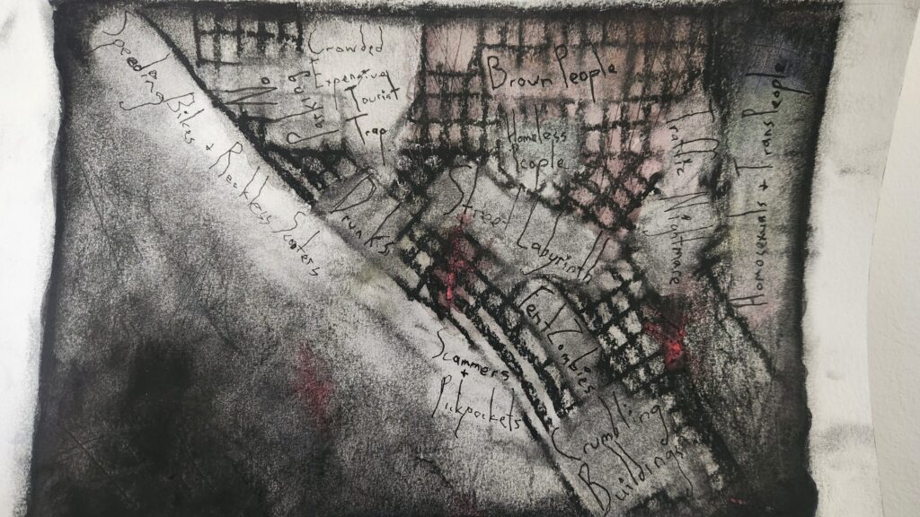

Maps are usually neutral, built to inform rather than to feel. This was my first piece in a series of emotion-inspired maps of Seattle, an experiment in expressing feelings through cartography. I chose anger for this one because Green Lake reminds me of the time I was so mad after being rejected by my crush that I beat my personal best for the 5k while running around it.
So, how does one make a map look angry? I tried a few things:
- Chaotic, angular linework
- “Hot” colors like red, orange, and yellow
- Dense, overlapping features to make the map feel tight and claustrophobic
Add in a soundtrack of death metal and a lot of fast, messy scribbling, and suddenly the map starts to seethe on its own.