
After recently attending the Esri UC and listening to many sessions about spatial analysis, I have been inspired to test what I’ve learned. The City of Minneapolis where I currently live has an excellent open data portal, just waiting for GIS nerds like me to download and have some fun. Now I will walk you through my data exploration of fire department responses from 2012-2015, hoping to identify (literal) hot spots in the city to help improve city service.
The Minneapolis Fire Department Does a Commendable Job and Has Improved Drastically — Case Closed
The most time consuming part of any GIS analysis is collecting and processing the data, and thankfully we don’t have to do any collection for this project. When the available data is as high quality as Minneapolis provides, complete with a consistent attribute table over a several year span, any pre-processing is seemingly unnecessary. As such, a quick dive right into analysis and reveals surprising results: the Minneapolis Fire Department has improved so much over this 4 year period that there are no major hot spots in time and space, only cold spots.
Check out the image below of an emerging hot spot analysis I ran in ArcGIS Pro using a space time cube with a neighborhood of 500m and 1 month. Except for downtown, Phillips, North Minneapolis, and the edges of the city where no pattern is detected, the entire city is some variation of cold spot, meaning that over time these areas have had statistically significantly fewer fires than their surrounding areas.
As much as we’d like to believe the Minneapolis Fire Department hires the greatest firefighters in the country, this map seems to contradict the overall picture of fires during this four year period, pictured below. The darkest red areas experienced over 1600 fires in 4 years, and the emerging hot spot analysis is telling us that there isn’t any sort of hot spot? Something fishy is going on here.
Let’s look at a more elementary analysis of the data in Excel to better understand what might be happening here. Based on the emerging hot spot results, I expected to see a serious decline in fires over the years. Looking at the table below, it’s apparent that the data from 2012 depicts either a conflagration due to total anarchy in Minneapolis or that there’s something different about how the data was collected. I didn’t live in Minneapolis in 2012, so I can’t confirm the former, but I did discover that the 2012 data included all fire department responses — not just fires but also things like helping cats out of trees and EMS assistance.
| Year | Fires |
| 2012 | 36,987 |
| 2013 | 1,249 |
| 2014 | 1,198 |
| 2015 | 1,313 |
Moral of the story: always play around with your data in Excel before breaking out the big guns and trying statistics or spatial analysis.
Back to Basics
I was in such a rush to do cool things and make major discoveries that I forgot everything that I’ve learned about starting simple. Most importantly, I didn’t develop questions to answer to give purpose to this analysis. Alright, so now that we’ve cleaned up the 2012 data by removing all those non-fire related responses, we can start the real analysis and find meaningful results.
Tabular (Non-Spatial) Analysis
The best way to start any analysis is to fire up Excel (or if you’re feeling really adventurous like I was, try learning or re-teaching yourself R or Python) and look at your data without the spatial component. What are the means, medians, and ranges of each field? What does the histogram tell you about each field? Are there any outliers? What are the discernible global trends?
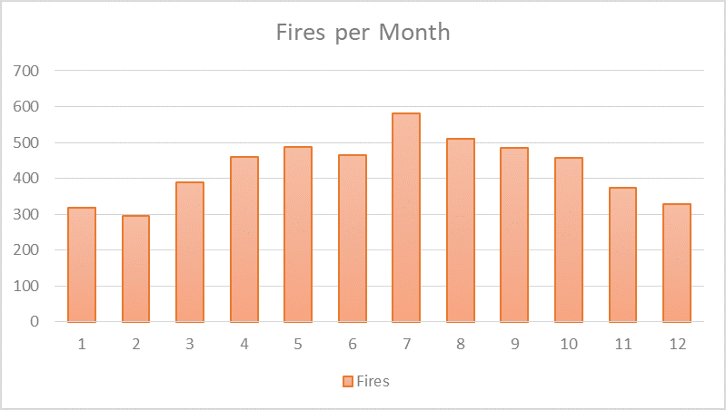
Let’s start by answering a basic question: When did fires happen? Looking at the bar graph of fires per month, it’s apparent that the summer months saw the most fires, with double as many fires in July as in February. This was most likely due to people using grills, firepits, and of course fireworks at a much greater rate in the summer — corroborated by the fact that July 4th and 5th had above and beyond the highest number of fires over any other days of the year at 48 and 35 fires respectively (interestingly the next highest day was April Fools Day at 28 fires). I’m actually surprised at the noticeable drop in fires during the winter; I had expected more due to people using fireplaces and antiquated heating devices.
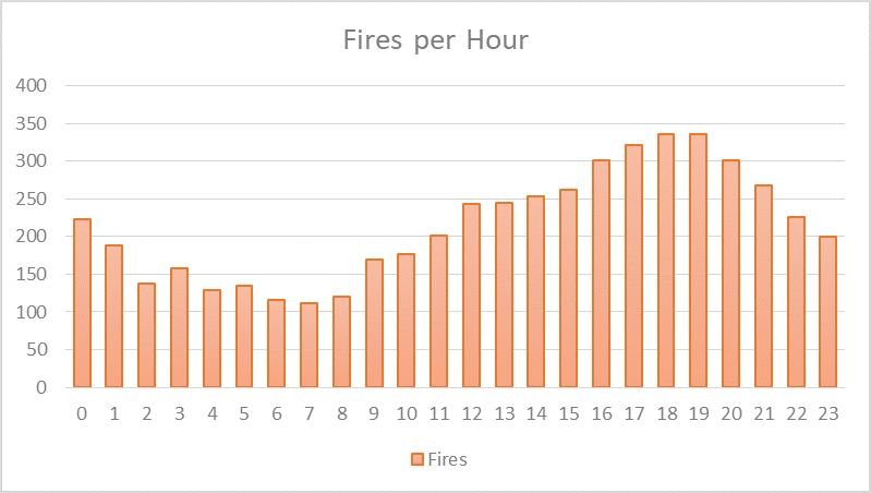
At a finer time scale, more fires occurred in the evening, with most occurring at 6pm and 7pm (they’re tied at 335 fires each) at a rate triple that of 7am, the lowest at 110 fires. My guess is these hours were when people were cooking dinner (or more appropriately, burning). Despite being sleepy-eyed, it seems people didn’t usually ignite their eggs and bacon early in the morning, or were smart enough to stick to cereal.
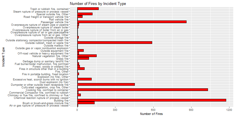
Now that we know when fires happened, we can ask what type of fires did firefighters mainly respond to? Looking at the bar chart below (P.S. I figured out how to plot in R), we can see that by far building fires, cooking fires, car fires, and garbage fires were by far the leading incident types. One particular category near the bottom, “chimney or flue fire, confined to chimney or flue”, sticks out to me — isn’t that just someone using their fireplace responsibly?
How many fires did each station respond to and how long did it take them to respond? The chart below paints a picture of an overworked Station 14, responding to more than 6 times more fires than Stations 12, 22, and 28 — we’ll come back to these numbers later by plotting them on a map to see where these stations are. On average, each station responded to 269 fires, about 67 per year or a little over one every six days. Now that statistic makes firefighting seem like a cushy job (assuming firefighters only respond to fires and nothing else)!
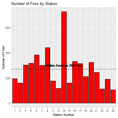
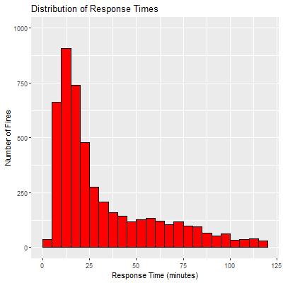
Another metric to determine performance is to look at how quickly firefighters responded to a fire, which in this case is the amount of time between when the alarm first sounded and when the fire was marked all clear. The histogram below is really impressive to me, and it definitely helps me sleep easy to know that firefighters extinguished most fires in under 25 minutes. Returning to the previous graph though, the overworked Station 14 also had the highest mean response time at 1 hour, compared to Station 1 with the lowest of 29 minutes (note that these numbers are definitely skewed by outliers).
Takeaways from Tabular Analysis
Let’s recap what we’ve learned here: most fires occurred in the summer and around dinner time; fires were mainly building fires and cooking fires; fires occurred at a rate of once every six days at each fire station; and most fires were extinguished in fewer than 25 minutes. From this simple analysis alone, we can already make recommendations to the City about possible fire safety education programs to teach people how to handle cooking fires, how to safely use a barbeque, and the safe operation of fireworks. We can also share which fire stations work hardest and may need more resources as compared to other stations.
Analysis of Spatial Distribution
Now comes the fun part. After becoming comfortable with the tabular data, we can make simple maps to start answering spatial questions. The first of these will be: Where do fires occur in the city?
One of the simplest measures of spatial distribution is the mean center, a point on a map calculated by finding the average latitude and average longitude of every point in a dataset (with this particular dataset, you could actually do this calculation in Excel by finding the average of the latitude and longitude columns rather than using the tool in ArcGIS). On the map below, you can see the mean center of the fires in bright red located in the middle of downtown, which unsurprisingly isn’t far from the mean center of the city as a whole, shown in bright blue and located at the intersection of I-94 and I-35W. The offset and direction of these points shows that fires were not equally distributed throughout the city and more fires occurred in the northwest portion of the city.
While the global mean center gives a general idea of the distribution, finding the mean center for each fire station area is even more intriguing. Looking at the map below, the mean center of fires within each station area is shown in light red. Contrast this point with the location of the fire station for that area, shown in dark red. Amazingly, almost all of the fire stations in South Minneapolis are super close to the mean center of fires in their service area. Great placement Minneapolis!
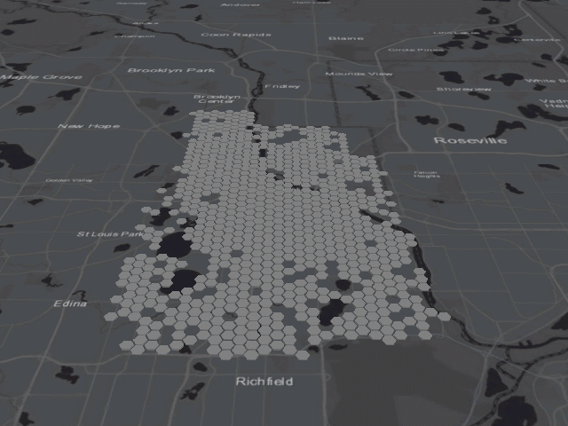
With over 5,000 fires throughout the city, spatial aggregation of some sort is absolutely necessary to determine any sort of distribution since the data would look like one big blob when plotted as points. We can use two methods: creating a grid covering the city with cells of equal area, or using preexisting boundaries with built in meaning. Since hexagons are the sexy new mapping trend, I created a grid of 500m hexagons. (Not only are hexagons sexy, they’re also more useful for later spatial analysis since the center point of every hexagon in the grid is equidistant from all of its neighbors’ center points, whereas in a traditional square grid, the distance between center points of adjacent and diagonal neighbors is different.)
From this map, we can immediately tell that most fires occur within the North Minneapolis, Downtown, Cedar-Riverside, Whittier, and Phillips neighborhoods. The major benefit of this type of aggregation is that each cell is exactly the same size, meaning the number of fires isn’t just a product of having a larger or smaller area. It’s important to note that changing the color classification scheme or size and position of the hexagons can change this picture more drastically than you’d expect.
The other method to aggregate points is to use the fire station areas, which has the added benefit of being able to assess the activity of specific fire stations. In the map below, we can see a similar pattern to the one shown by the previous hexagon grid, but now we can see the workload for each fire station. Remember overworked Station 14 identified in our previous chart? That corresponds to the darkest shaded area in North Minneapolis.
However, this map is not as informative as it seems, since the darker colors also correspond to the densest and most populated parts of the city — essentially this is a glorified population map. Normalizing these numbers is crucial to determine any patterns. Unfortunately, the functional design of station areas means they don’t play nicely with census block groups, and I don’t want to take the time to interpolate the population for each station area. Normalizing by area is another option, providing a measurement of fires per square kilometer that is simple to calculate. I tried this, but the map more or less looks the same, probably because the shapes are similar in size.
The simple alternative is to use census block groups and to do a spatial join with the fires, which allows you to incorporate all the demographic information you could ever want. Below you can see a map of fires per capita in each block group created using 2012-2016 American Community Survey 5 year estimates — this paints a much different picture than our earlier maps. Now areas with low populations are highlighted, most notably the industrial areas along the west bank of Mississippi River and in Northeast Minneapolis along I-35W in addition to the one dark red block group that includes the Minneapolis Convention Center.
Takeaways from Spatial Distribution Analysis
Mapping these points has yielded the following information: fires were distributed to more to the northwest of the city; fire station locations are almost perfect in South Minneapolis; fires occurred most frequently in North Minneapolis, Phillips, and Downtown as evidenced by multiple aggregations of the data.
Cluster Analysis
After mapping the distribution of fires, we have a better idea of where they occur. The next step is to determine whether any of these areas have significantly greater or fewer fires than other areas nearby, identifying clusters and areas to target prevention measures and improve fire response. Thus our question is: Where are statistically significant clusters of fires?
Understanding Cluster Analysis
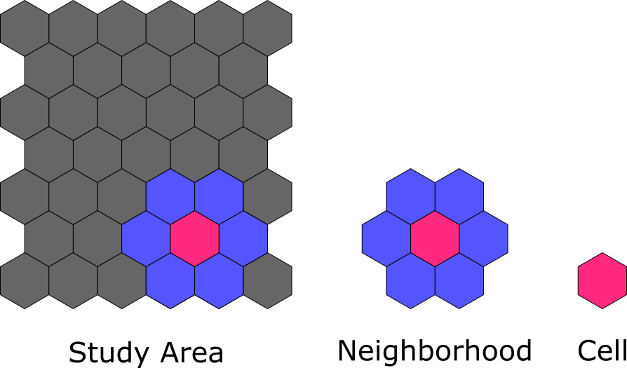
To understand how spatial tools perform cluster analysis, it is important to first know these three geographic units: the study area, neighborhood, and cell. The study area is the entire area being analyzed and consists of a grid of cells — the smallest individual spatial unit. The neighborhood consists of the cells surrounding any particular cell and may or may not include that particular cell, depending on the statistic being tested. See the illustration below to help visualize the concept.
One common statistical technique to find clusters is called hot spot analysis or the Getis-Ord Gi*. This tool iterates through each cell in the study area and compares the values of the neighborhood (including the center cell) to the global average of the study area. If the values in the neighborhood are significantly (i.e. statistically significant) higher than the global average, the cell is labeled a hot spot. If the values are significantly lower, the cell is labeled a cold spot.
Another statistical technique is called cluster outlier analysis. This tool also iterates through every cell in the study area, but the neighborhood does not include the cell itself. First, the tool checks whether the cell’s value is significantly higher or lower than its neighborhood, and then it compares the neighborhood to the study area to find whether the neighborhood is significantly higher or lower than the study area.
Applying Cluster Analysis
The first test is to run Hot Spot Analysis to determine which cells may be significantly higher (hot spots) or lower (cold spots). View the results on the map below. Unsurprisingly, the hexagons that had the highest values in the previous choropleth map showing the number of fires per hexagon are also hot spots, mostly in the North Minneapolis, Downtown, Cedar-Riverside, Whittier, and Phillips neighborhoods.
Next, we can use Cluster-Outlier Analysis to identify areas of significant clustering (high-high or low-low clusters) as well as areas that are significantly dissimilar to their surrounding areas (high-low or low-high outliers). Looking at the results mapped below, this test produced similar results to the hot spot analysis above, showing high-high clusters in the North Minneapolis, Downtown, Cedar-Riverside, Whittier, and Phillips neighborhoods. All of the low-low clusters are either outside of the city limits or in unpopulated areas such as the parkland on the north side of Lake Harriet. Of the three low-high outliers found — areas experiencing significantly fewer fires than their surroundings — the northern-most outlier covers Crystal Lake Cemetery and the outlier in the middle covers the Mississippi River. However, the southern-most outlier is the interesting case, covering the industrial area and Target/Cub Foods shopping center just northeast of Hiawatha Avenue and Lake Street; although not many people live in this hexagon, the amount of traffic in this shopping area makes this result surprising.
Takeaways from Cluster Analysis
The most important thing here is that both hot spot analysis and cluster outlier analysis confirmed that the areas shown with more fires in the distribution analysis are statistically significant. This helps confirm that areas highlighted in earlier maps were not just due to classification schemes or hexagon size.
Space Time Analysis
Up until this point, we’ve viewed the data as a cumulative total from 2012-2015 without considering the effect of time. Although we’ve identified a few hot spots, we need to check if these places are consistently hot spots over time or if there was one particularly bad year that skewed the data. ArcGIS Pro has a new set of tools in the Space Time Pattern Mining Toolbox that will help us do just this (let’s be honest here, really the entire reason I even started this project was to use sci-fi sounding “space time cubes” for something practical).
Adding the Dimension of Time to Cluster Analysis
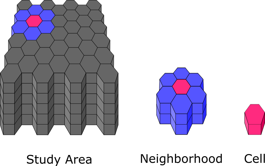
The key concept here is to realize we are now working with three dimensional data with time as the third dimension. Recall the illustration from earlier that explained the concepts of the study area, neighborhood, and cell. With the added component of time, what was previously a hexagon of, for example, 1 km area is now a hexagonal prism with an area of 1 km and a height of 1 month. Similarly, the neighborhood is not only the cells around the sides of the hexagon, it now also includes the months before and after the cell\’s month. The study area includes the entire area and also the entire duration of the data divided into months; for example if the data covers one year in time, then there would be 12 hexagonal prisms stacked on top of one another for each cell space. This 3D study area is also referred to as the space time cube.
Applying Space Time Analysis
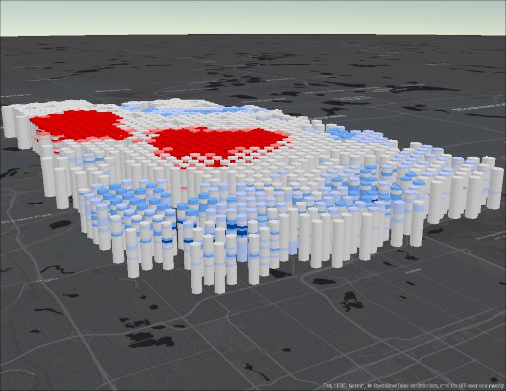
The first test uses the Emerging Hot Spot Analysis tool, which is essentially the three dimensional version of the Hot Spot Analysis tool used for cluster analysis. In a basic sense, this tool creates hot spot maps at a specific time interval for the entire duration of the data, then overlays each map on top of one another before designating the overall hot spot category. The field of hexagonal skyscrapers below depicts this method, showing red or blue bands designating a cell as a hot or cold spot for a specific interval of time.
The results of this tool are much more complicated to understand than the two dimensional Hot Spot Analysis due to the many categories necessary to explain how an area may change over time. Read Esri’s article about how the tool works to better understand the meaning behind each category. Since we’re interested in (literal) hot spots, I will focus on those areas in the map below.
Again, the same areas in North Minneapolis and the center of the city are labeled as hot spots; however, the temporal component of the data revealed greater nuance. The most central portion of these neighborhoods are labeled as either the dark red “persistent hot spots”, places that were consistently hot spots for a minimum of 90% of the time intervals, or the gradient of yellow to red “intensifying hot spots”, which similar to persistent hot spots were consistent for at least 90% of the time intervals but were also significantly increasing in intensity over time. These intensifying hot spots should be the places of most concern for the fire department because the fires were persistent and increasing in number over time.
The second test is the space time compliment of the Cluster Outlier Analysis tool from the previous section, called the Local Outlier Analysis tool. Much like the Emerging Hot Spot Analysis tool’s stacks of hot spot maps, this statistic involves layering cluster-outlier maps on top of each other to determine an overall category for the cell. However, these categories are mostly the same as the tool’s two dimensional counterpart, only with the addition of a “multiple types” category. The results are mapped below.
The main interest in this map are the bright red hexagons, which are areas where significantly greater fires occurred over time than in the neighboring hexagons. These are areas requiring further investigation, particularly because none of the high-low outliers are within the neighborhoods identified during our earlier cluster analysis — why did so many fires ignite there over these four years?
You’ll also notice that there are quite a few purple hexagons on the map above, signifying that multiple types of clusters and/or outliers occurred in that area over time. This is one of the pitfalls of this tool, since those purple cells tell us nothing of value. Luckily, we can use the Space Time Cube Explorer Add-In for ArcGIS Pro to look at the individual “cubes” that make up those purple cells.
I created the animation above to give you an idea of what is happening underneath all those purple hexagons. Pay close attention to the areas marked purple on the previous map, and you’ll notice two patterns. In North Minneapolis and the center of the city, the cells fluctuate between categories of high-high cluster and low-high outlier. Because so many fires occurred in these parts of the city, this pattern isn’t surprising; if any of the cells in this area had a lower than usual amount of fires, they were almost certainly going to be an anomaly when compared to the high amount of fires in neighboring cells. Similarly, in South and Northeast Minneapolis, cells oscillate between being low-low clusters and high-low outliers, representing the exact opposite effect.
Takeaways from Space Time Analysis
This entire analysis has followed a progression, first mapping the distribution of fires, then determining which areas on that map had significantly more fires than its neighbors, and finally discovering which areas on that map were consistently hot or cold over time. In all of these hexagon maps, the North Minneapolis, Downtown, Whittier, Phillips, and Cedar-Riverside neighborhoods were highlighted. In particular, each of these neighborhoods also had cells that were intensifying over time — places that the fire department should focus on.
Conclusions
I’ve realized that I probably put quite a bit of effort into something that I could have learned in a short conversation with firefighters from different parts of the city: more fires occur in North Minneapolis and the center of the city than any where else. Given my own knowledge of the city, I’m not surprised these were the results. However, it is important to consider what the contributing factors to this problem are now that we know where the problem is most pronounced, which will help us address the problem in the future.
My first observation: the hot spots exist in areas where housing stock is particularly old. Not only is this a problem because outdated construction techniques and old dry wood makes these houses fire hazards, but also because these houses might not have fire suppression or smoke alarm systems that help keep residents safe when fire does happen. Another observation is that these hot spots also occur in the lowest income neighborhoods in the city. One study that looked at fire data from Dallas in the 90s concluded that injury was more likely among low income residents, minorities, the elderly, and in housing built before 1980, which is especially problematic given that these demographics describe where most fires occur in Minneapolis.
I hope you’ve enjoyed this long journey through space and time! Even though I could probably write a paper about what I’ve done here, it still seems like there is still so much to learn from this data — things like finding factors contributing to fire occurrences and doing network analysis to determine which roads fire trucks travel most frequently and where the optimal fire station placements are. In the future, I might try to run some regressions to test for a correlation with income, housing age, population demographics, and the number of fires. Just glancing at the map it is clear there is more to this problem than that these areas simply have higher and denser populations. Keep checking back to read about my future exploration of this data and more!