
As the #1 bike friendly city, you won’t be surprised to see the growth of the Nice Ride bikeshare program in Minneapolis. Visualizing the change over time is difficult to do using a static map, so I opted for animation to really show the expanding network and increase in trips. I present to you my results:
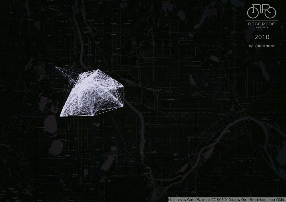
This GIF was fairly simple to create. First I downloaded the data from Nice Ride’s website and mapped out the station locations. Then I used the XY to Line tool to create lines between each origin-destination station pair and changed the line width to symbolize the number of yearly trips between those two stations. I exported a map for each year and then used GIMP to combine them as a GIF and add the logo and year information in the upper right hand corner.
This map isn’t perfect. Since Nice Ride’s data only includes origins and destination points, the map only shows trips as the crow flies rather than the actual routes taken. The density of stations and trips in downtown Minneapolis creates a white blob, making it difficult to discern which stations are popular. As such, this visualization is only useful for showing the expanding network and is not ideal for meaningful analysis about where people are traveling. However, I think it is cool to watch the bikeshare blob overtake the city and travel deeper into St. Paul.