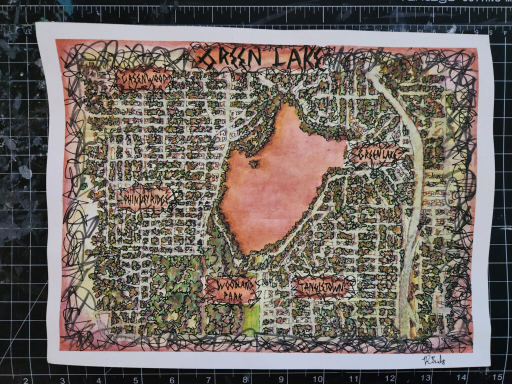

I lived in Fremont for 2 years (add another year if you include the part of Wallingford on this map). While I enjoyed easy waterfront access and the view at Gas Works Park, I ultimately moved away due to boredom. The corporate tech takeover of the neighborhood has made Fremont has lose its soul, though not to the extent of South Lake Union (or worse, Bellevue).
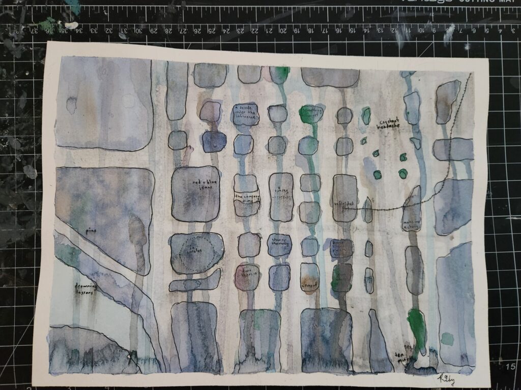
This was a rare opportunity for me to use both my MBA and degree in GIS, combining map making techniques with business speak.
Here are the techniques I used to make this map evoke boredom:
- Distorting the landscape so the street grid is perfectly regular
- Allowing only 90 and 45 degree angles on shapes
- Labels cut from paper using a default font reminiscent of label-makers
- Desaturated colors to look mostly grey and beige
- Repetition of simple geometric shapes
- Corporate jargon in place of geographic and place names
The biggest takeaway from this exercise was that I should invest in traditional hand-drafting tools to make drawing a perfect grid less annoying.