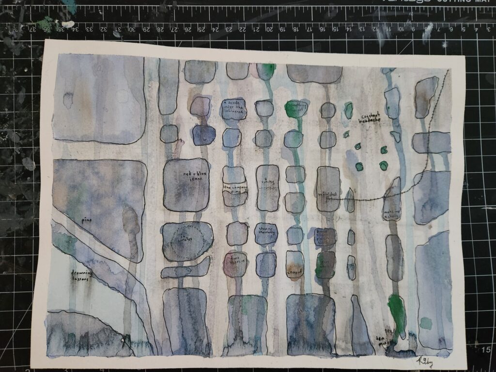
I used to live in Downtown Bellevue, and I hated it. It felt like someone took the corporate soullessness of South Lake Union and somehow made it less walkable (hence why I exaggerated the width of the streets in this map). So when I decided to make a map inspired by sadness, Bellevue was the obvious choice.
Sadness as creative inspiration is nothing new, but it’s one of the few emotions people can easily see in their minds. Watercolor, with its soft edges and tendency to blur and run, is ideal for sadness. It even looks like tears when it dries.
Here are the techniques I used to make this map feel sad:
- Small, lowercase letters to convey quietness and fragility
- Labels borrowed from emo song titles
- Cool, desaturated blues to suggest melancholy
- Tilting the paper to let water stream down like tears on a face
- Dripping water over wet paint to create blooms and unpredictability
- Sparse details to evoke emptiness and isolation
Combine all this, put on the perfectly titled emo album Home, Like Noplace Is There by The Hotelier, and you too can make a sad map.
