
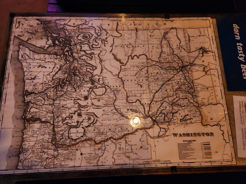
One bar I frequent has old maps under the glass tabletops in each of the booths. I’ve spent quite a lot of time staring at the map pictured below, and decided I wanted to try to recreate its old-timey style. Despite its beauty and charm, however, I do not think this is a well designed map, so let me offer my opinion about improving it first.
Critiquing the Map
Every map serves a purpose, usually to show someone where something is. If you’re not trying to answer someone’s “where?” question, you probably should visualize your data with something other than a map. Judging by the legend, this map’s purpose is to show the location of railroad lines and their owners throughout Washington state. Given the lack of anything else in the legend, we can assume there are no other intentions for this map.
Speaking based on the map’s purpose, I will say this is a bad map. To me, it looks like something a beginning cartographer would make because it tries to cram too much information on a page — so much so that it clouds the data pertaining to the maps purpose. I can imagine this mapmaker being an apprentice with a master telling them to always include certain things, much like today’s geography professors telling their students to always include a north arrow, scale bar, legend, etc.
Beyond just a map’s purpose, you must consider its intended audience. I am unable to ascertain this map’s audience, even after looking closely. Is it intended for railroad barons so they may understand where their competition is? Is it for land speculators so they may know the best places to purchase property? Is it for the general public to understand where the railroads go? It is unclear.
Making the Map Better
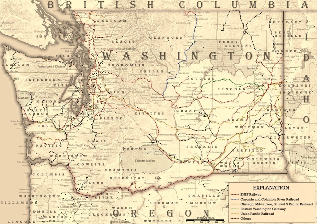
The first step to improving the map is selecting a purpose and an audience. From there, all design decisions will flow. To me, it seems that this map intended to show locations of railroads, where they go, and who owns each specific line. The audience is the business community — people who may need to use rail transportation to ship goods. As a business owner, I should be able to look at this map and determine something like “BNSF owns the track between Seattle and Spokane, so they are who I should call to transport my widgets between those cities.”
Now that we know the purpose and the audience, we can determine which features are actually important instead of mixing together everything we can possibly find. Obviously we need data for railroad lines and the important places they connect, but what else? Think like a business owner using this map. Are there seas, rivers, or lakes I could use to transport my goods instead of railroads? Does the railroad go over high mountain passes that might be subject to winter closures? By asking the right questions, we can determine the best features to include.
Styling the Map
A map’s purpose should be obvious, which is another issue I have with the original. You can only tell that it’s a railroad map by looking at the legend. The railroad features are not prominent despite being the only source of color on an otherwise grayscale map.
To help the railroads “pop” more, I toned down the intensity of everything else on the map. Absolutely nothing used pure black, all labels, line colors, and symbols were varying shades of grey. I also decreased label sizes and the density of information.
Elevation and Terrain
The elevation and terrain were probably my least favorite parts on the original map. The author’s dark hashed lines really made it hard to see anything else around the mountainous parts. Furthermore, the frequency and placement of contours was too minimal, to the point that it looks like the Cascade Mountains are just a series of plateaus.
Trying to emulate the original map’s contour style was too difficult using high resolution DEM data. While hillshading wasn’t common in the old days due to a lack of aerial imagery and elevation data, I decided one anachronism was acceptable, especially if I limited its use. To only show hillshading in mountainous areas, I calculated a slope layer using the DEM and applied shading so flat areas were completely opaque and steep slopes were transparent.
Coasts and Water Bodies
A technique you’ll frequently see on old maps is a series of rhythmic contour lines along the coast, as if water was rippling away from the shore. I would argue the contours made the relatively narrow Puget Sound too dark in the original. In any case, this technique is easier to do by hand rather than making a series of buffers or calculating a distance raster. Instead, I settled for a gradient from dark to light grey to create a similar effect.
The original map also used contours on lakes and other large inland water bodies, which made them extra dark. I shaded them the same color as the ocean instead.
Labeling
You can easily make your map look older simply by using the right font face for all your labels. Choose a serif font with a typewriter style (I used Rockwell for most of the map). Add in spacing between letters for larger areas like states and counties and italicize labels for water bodies. For major labels, type in all caps to further the historic look.
Finishing the Map
After you export your map, open it in your favorite image editing software and give it a nice sepia tone.
Data Sources
- Railroad lines and ownership: https://opendata.arcgis.com/api/v3/datasets/d840cbadf3d04ccea6ee1063b01d802f_1/downloads/data?format=shp&spatialRefId=4326&where=1%3D1
- Important places: https://hub.arcgis.com/content/9e25e210684c4acfbab785b9c4e3ed2d/about (for use in QGIS, use 7zip or another utility to unzip the ArcGIS layer package and extract the geodatabase)
- Water bodies: https://geo.wa.gov/datasets/waecy::hydrography-major-waterbodies/about
- Rivers: https://hub.arcgis.com/datasets/esri::usa-rivers-and-streams/explore?location=47.234333%2C-120.674712%2C8.14
- Elevation/terrain: 90m SRTM data
- State, county, and tribal boundaries: TIGER/Line cartographic boundary shapefiles from the U.S. Census Bureau
- Canadian boundaries: https://www12.statcan.gc.ca/census-recensement/2021/geo/sip-pis/boundary-limites/index2021-eng.cfm?year=21