
I was inspired by Mapbox designer Topi Tjukanov’s 3D map called “Barrier Effect” that tries to illustrate the dividing effect roads can have on cities. Pedestrian accessibility is something I am passionate about, so I wanted to see what his concept would look like in my own city of Seattle.
To get started, I downloaded street data from the city’s GIS portal. After some cleaning in QGIS, I used the plugin BlenderGIS to import the shapefile into Blender and add a height component based on the speed limit field of the data.
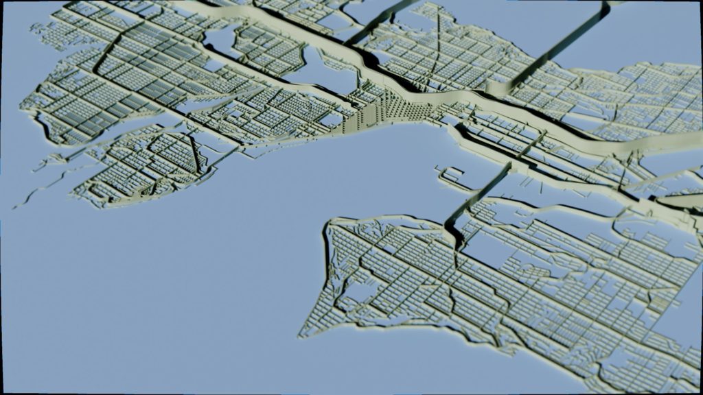
Looking at the map, the freeways immediately stick out, with Interstate 5 splitting the city in half from north to south. Some of the main arterials stick out, like Aurora Avenue to the west of Lake Union, but for the most part, the dividing effect doesn’t seem too bad.
Anyone who has driven around Seattle will know that the city has a rather even distribution of speed limits with very few roads having a limit above 35mph. However, this does not capture how people actually drive. Leary Way connecting the neighborhoods of Fremont and Ballard has a posted speed limit of 25mph, but on this wide road with 4 travel lanes it is all but impossible to drive that slowly — most drive somewhere between 30 and 40mph. The same can be said of Elliot Avenue/15th Avenue that connects Ballard to Downtown. Not even police officers obey the posted 35mph speed limit on this freeway of a road with 6 travel lanes, with most people driving 40-50mph.
Nor does speed limit capture the feeling of crossing some of these “slow moving” streets. The best example is the infamous Mercer Street through South Lake Union, a traffic packed road with 6 lanes of travel plus turn lanes and a wide median. The traffic and constant stoplights means that people rarely speed through, yet the width and amount of traffic makes crossing this street as a pedestrian uncomfortable.
As an attempt to better model the barrier effect of roads, I tried visualizing the height based on the road’s classification, another field available in the dataset I used. This ranks the purpose of the road ranging from neighborhood streets all the way up to highways.
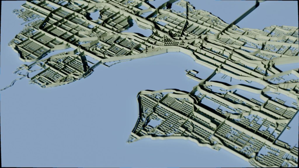
I would argue this method illustrates the barrier effect in Seattle more accurately than speed limits. Now, the streets I mentioned previously properly show their barrier effect, but not without limitations. It certainly overemphasizes the impact of some minor arterials. Additionally, it fails to visualize the neighborhood character of some principal and collector arterials, such as 45th Street through Wallingford.
After doing this exercise, I think the best method would combine several metrics, including: speed limit, road width, traffic count, and road class. How would you go about mapping the barrier effect in your city?