
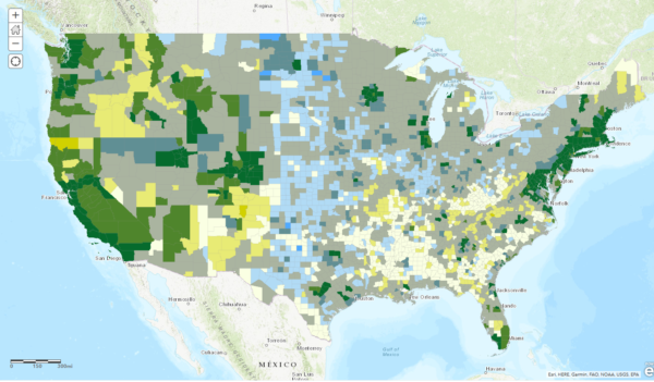
This week, my coworker showed me a cool map from Esri’s Living Atlas relating median home values with median incomes in the U.S. — click the image below to pull up the interactive map. I thought it was a cool idea, but something bothered me about the map. Later that night, I had a shower epiphany and realized I didn’t like the map because it didn’t tell a compelling story or present any new information: the coasts are expensive and flyover country is cheap. Boring.
What’s wrong with the map
Look at the map, what pops out at you, where do you notice? Immediately, the icy blue of the Great Plains and the forest green of the Northeast and West Coast pop. You can easily point out all the major cities — places where housing is generally more expensive but jobs pay more — including Minneapolis, Chicago, Miami, Austin, Portland, Denver, etc. Essentially, you learn nothing from this map that you didn’t already know, that housing costs and incomes are higher where more people live and where there are more jobs.
Part of this is due to their choice of color scheme. A more interesting map would have chosen the darkest, most saturated colors to highlight the most interesting areas: where incomes are low and housing costs are high and where incomes are high and housing costs are low. On any bivariate map, you want the most noticeable color at the top of the legend diamond, the “high-high”, to represent something that is either the most “bad” or the most “good”. Here, high income would be “good” and high housing costs would be “bad”, hence why the scheme doesn’t work well.
Beyond that, however, the map doesn’t account for the regionality of both income and housing costs nor whether the differences are statistically significant.
How to improve the map
When making any map, it’s important to consider the story the data tells and whether that story is compelling or not. Esri probably chose these two datasets, income and home value, precisely because they are easily understood by the audience, have some sort of relationship, and can illustrate the power of a bivariate map — all important elements. However, they forgot about the main purpose of illustrating a point. First and foremost, this map should identify areas where housing is either super affordable or super unaffordable.
Second of all, it’s important to account for regional differences rather than considering a county as a whole. The solution is to use the Getis Ord Gi* statistic, better known as hot spot analysis (read my more in-depth exploration of this tool with fire data in Minneapolis). This accounts for a region by taking one county and calculating the average for that county and all bordering counties, then comparing that to the average for all counties in the U.S. The result identifies places where incomes or home values are significantly higher or lower than the U.S. average and produces a Z-score stating how many standard deviations higher or lower each county is than the average.
The results
Using 2017 American Community Survey 5-year estimates for median income and median home value in each county, I ran the hot spot analysis tool for both variables.
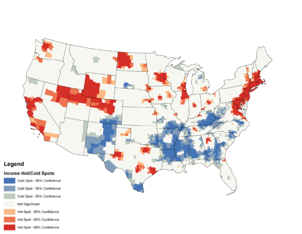
First, looking at median incomes, you’ll notice that major cities once again pop out as red in addition to much of the Northeast, California, North Dakota oil fields, the Rocky Mountains, and mining areas of northern Nevada. Infamously poor areas like Appalachia and the Mississippi River Delta appear in blue. It’s notable that Phoenix, Miami, and Las Vegas are all statistically insignificant.
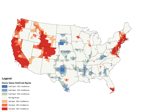
When looking at home values, a similar trend appears with California, the Pacific Northwest, the Rocky Mountains, and the Northeast as well as a handful of major cities all appearing in red. In blue, you’ll find parts of the Great Plains and poor areas in Appalachia and the Mississippi River Delta.
Now that we have a more accurate picture of income and home value in the U.S., how should we combine them? Simply creating another bivariate map is problematic since the color emphasis on “high-high” will remain; instead, we want to preserve the diverging color scheme from red to blue, highlighting the “affordable” and “unaffordable” counties. I chose to subtract the Z-score of income from the Z-score of home value (a Z-score is the number of standard deviations from the U.S. mean). The results are below.
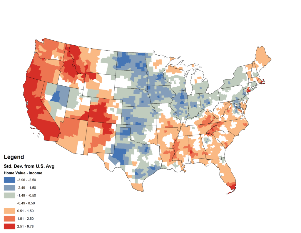
What does this map show? Using San Francisco County as an example, the exorbitant home values produced a Z-score of 12 while the high-paying tech salaries contributed to a Z-score of 5. Subtract the two, and you’re left with 7, meaning that despite having higher than average incomes, the homes in San Francisco are still expensive — even more than would be expected given the greater incomes.
On the flip side, in Hennepin County, Minnesota and home of Minneapolis where I live, home values have a Z-score of 3 and incomes have a Z-score of 6. The difference yields -3, meaning that home values are relatively cheap compared to the county’s high salaries.
Conclusions
Now that we understand how my calculation works, we can start drawing conclusions from the data. The areas in blue/green are all the cheapest and most affordable places to live. Conversely, all the areas in red/orange are the most expensive places to live. Areas in white are about average.
The new map is much more interesting since it reveals that not all big cities are expensive places to live when adjusting for how much you can expect to earn. Texas and the Midwest (save for cabin country in Minnesota, Wisconsin, and Michigan) are quite affordable. In the rural South, home values are lower than in the rest of the country, but incomes are much lower, making what would otherwise be a cheap house unaffordable.
What other trends do you see? What do you find surprising? Let me know in the comments, and thanks for reading!